Categories
Web development

SVG Update

SVG logo
I’m a big fan of SVG, and have in the past worked on several projects involving the format. I haven’t really done anything with it recently though, but there’s been important developments recently that I feel really deserve mentioning.

SVG Web

SVG Web – Is a brand new work-in-progress but highly advanced JavaScript library that provides support for SVG in Internet Explorer (using Flash).

This is especially nice because getting SVG to show in IE before required users to either install the (no longer supported) Adobe plug-in, or to render it as another graphic file. No more! Since so many people already have Flash, it’s a great way to bring SVG to the masses.

The other advantage to this is that more SVG on the web will encourage Microsoft to support it natively in IE9, since one of their arguments for not supporting it has been that it’s not prevalent enough. Native support may also mean SVG-in-CSS support, which is something else I’m a big fan of and which can unfortunately not be emulated using the SVG Web library.

Scour

Anyone that has created an SVG file using GUI software and then opened the file in a text editor will have noticed large amounts of redundant data. The data makes sense for the editor, but is really wasteful when you want to use the file on the web.

Enter Jeff Schiller‘s Scour. This Python script parses SVG files, removes all unnecessary data, and leaves a nice, clean, minimal file that looks exactly the same as the original. If you’ve used “Save for web” in Photoshop before, you get the idea.


So what are you waiting for? Grab your Inkscape, design a masterpiece, Scour it, SVG-Web it, and share your vectory goodness with the world!
Categories
Web development

Fyrdility 2.0

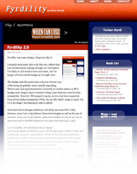
Picture of new designFyrdility has a new design. Hope you like it!
I actually took some time with this one, rather than just incrementally making changes as I had before. I’m likely to still tweak it here and there, but I’m happy with the overall design as it is right now.

The design uses the same basic colors as the last one, while being (hopefully) more visually appealing. There’s also less experimentation (currently no border-radius or SVG background image), since I wanted to keep most features cross-browser compatible. However, IE6 support is gone, as you may have suspected from all the alpha-transparent PNGs. As my IE6 visitor usage is under 2%, it’s a privilege I am thankfully able to afford.

Note that future changes/additions will likely see more SVG/CSS3 features, since I am a big believer these technologies as well as the use of progressive enhancement. I just want to make sure I put them to proper use, and not just for sake of it (as I have been guilty of before).

I’d also like to add more interface improvements, as I love working with jQuery and improving the visitor experience. The biggest challenge I suspect is to find a way to improve things for visitors that are already used to standard blog/website conventions. I myself am not a fan of new features on sites that should make the experience better, but end up just confusing me or that give a sense of disorientation.

Your feedback is appreciated, especially let me know if you notice any accessibility issues or you feel your experience could be improved somehow.

Categories
Web development

Feed for When Can I Use

Feed logo
Any minor changes I have made to WCIU so far have been undocumented. They didn’t seem worth blogging about and tweeting about them seemed a bit silly too. Since the information may be useful to people, I’ve decided to create a simple RSS feed that will be updated whenever a change is made to WCIU.

The updates will include bug fixes and any new interface options, but most importantly they will include information on browser releases and their new support for features. Thus by subscribing to the feed, you won’t miss any new developments on support for your favorite features.

Additional options may appear in the future, like only seeing information for news on specific features. Will see.

Categories
Web development

Browser Comparison on When Can I Use

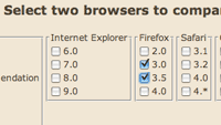
Snippet of browser version options

I have added a new mode of displaying feature support information on “When Can I Use” resulting in the ability to select two browsers and only see what the differences are in feature support.

This allows you to pit two different browsers against each other to see which one outdoes which in what areas, but it is also useful to get a quick overview on which new features can be used in an upcoming release. For example, selecting Chrome 1 and 2 will let you see which new features are now available in Chrome 2.

This new mode will also tell you how much better one browser version is than another, note this is highly unscientific and doesn’t take into account support of features not mentioned on When Can I Use. Still, it’s kind of entertaining. Also, the mode generates URLs from your selection, so feel free to share your results with others.

Currently it only shows differences in support, I plan on also providing the option of displaying support common in both versions, as well as missing support. There may be a few other rough edges that need fixing, please let me know if you see anything that looks odd.